Data’s Journey is one of the rare projects where I was the sole designer. After examining the scope of the job and the client’s preferences, I put myself into position to explore and nail down the look of the characters and the world. This meant cycling through several design rounds, and working closely with Graffects chief Mike Andriola to find our look.
For the first round I proposed a sort of cute take on TRON that I rendered with ToonBoom Harmony. It was a fun look (and actually included a rough animation test), but it was deemed a little too dark and trippy for this piece. Still, it was a valuable contribution, as it provided some of the creative that would carry through the project, and helped me to zero in on the client’s sensibilities.

The next round had me exploring flatter, more primitive shapes with an organic feel to them. Again, while this was not the final look, it was well received and gave us many new insights into the client’s vision. It also was the beginning of concept development for the workshop interior, which promised to include many wild new takes on how Data movement should be represented.
Look 3 is where the palette and the render style start to come together, even while the character designs are still a work in progress. I used Adobe Animate to explore the flat and colorful style that the client was responding to. We had our story and tone together at this point, and the color treatment was working… now we were looking for the best way to represent the characters… and this was not quite it 😉
Another pass in, we found the look we wanted for the main character…. though we would ultimately make a couple more vital changes.
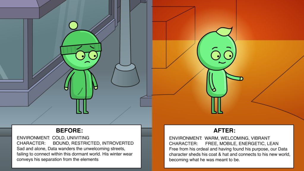
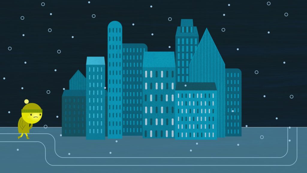
Now that we were circling the neighborhood, it was time to introduce some environmental elements into the work and define our characters a little more tightly. Color was very important for this pass, as it was a key part of the character’s emotional journey.
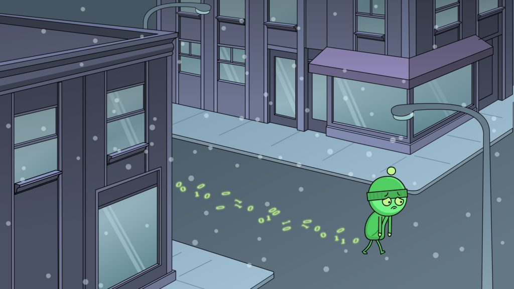

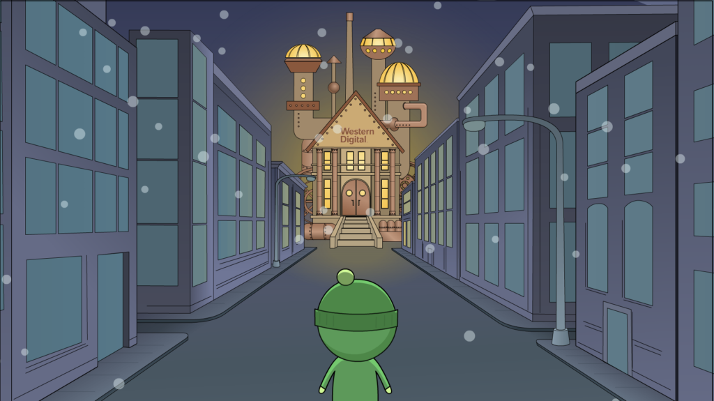
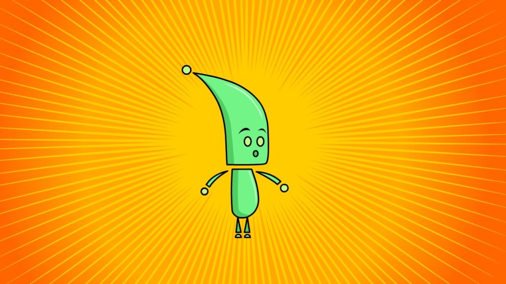
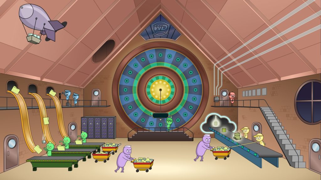
In this pass, I began making minor tweaks to the character’s proportions – the size and placement of facial features, the curves of the body – even the placement of the ball over the cap to illustrate emotional state. I also began exploring the magical workshop where the character would find a purpose. This was no small accomplishment, as there were dozens of concerns that fused design, motion, story sequencing, messaging and strategy with the client’s sensibilities. On top of that, there are a hundred little things happening in one massive layout.
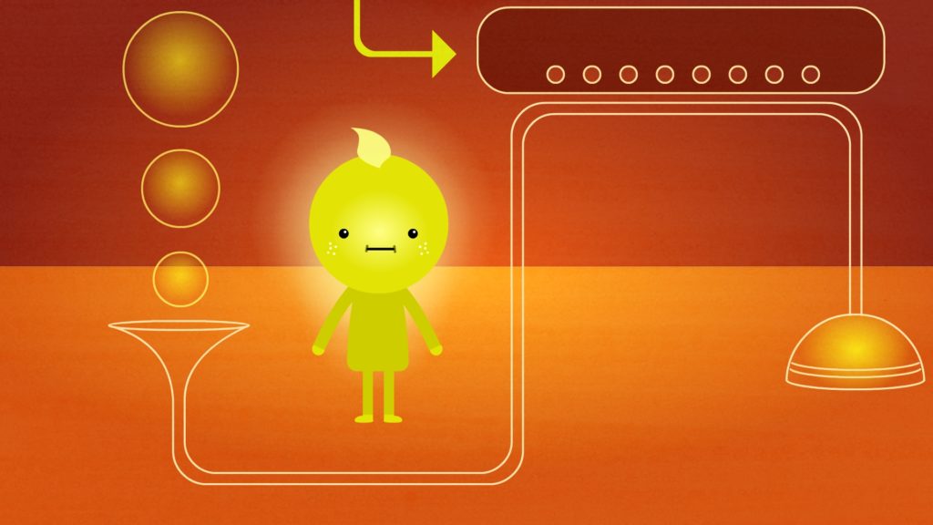
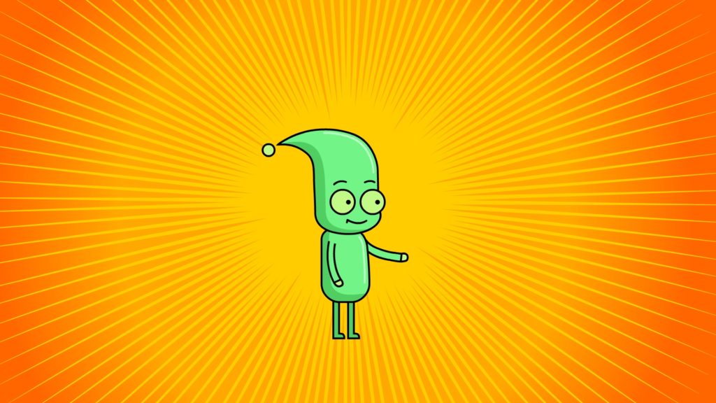
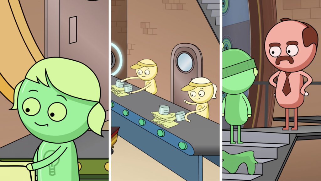
Our main character still had some tweaks (like adding the word “DATA” to the jacket). The supporting cast evolved as well; while Data is a non-gender-specific character, those in the workshop were given hints of gender, even as the animation process was underway.
Thanks to my careful rigging process, these last minute changes were not terribly time consuming, and animation moved forward at a good pace. Within a few weeks, we took this pice from a rough animatic to a fully animated short, and the result is a satisfied client and a great holiday card.
Tony